The surface of plant material is defined as texture and the human eye finds more interest in variety. Textual contrasts of plant materials make the arrangement more attractive. To make floral compositions attractive, try to select different plant materials with rough and smooth texture. Shiny petals of a flower placed amongst rough textured leaf dry will draw more attention than if placed with shiny leaf.
There are many descriptive words for plant material.
Bristly, sticky, polished, dull, tough, rough, fine, waxy, satiny, delicate, coarse, shiny, fuzzy, creepy, silky, hairy, rubbery, firm, woody, leathery, furry, corky, scratchy, glossy, crinkly, slimy, hard, wooly, etc.
Become aware of the change in texture when the plant material dies. Hold and touch each plant material. Get to know its texture before use.
General hints,
If the container dominates, use bigger bolder plant material.A design of dry, modern, or monochromatic materials requires strong textural contrasts. A pebble may appear smooth but a group appears rough.
Make a list of contrasting textures as far as color goes. Also see if anything arouses an emotion. Make another set with similar textures on another page.
Try and find pictures for reference.
As well as being a type of form, line expresses the mood or character of the design. Line is an expressive element, which creates a visual path giving life by movement.
In your design, build a visual pathway as you work. Check for the dominant line. Create rhythmic variations using line materials. Do not have visually equal amounts of vertical and horizontal lines in the same design. Employ unequal amounts of various lines.Think of character lines and express moods etc.
The overall area which encompasses a design. A key element space defines and enhances form and acts as a foil for solids. Consideration should be given to space within and around a design. Space may be boundless or enclosed.
Think about the space in skeleton leaves and a tangle of vines. Think of movement in space.
Form is the structural quality of any plant material. Form is identified in space. Round forms have a strong inward focus. Therefore, the center of a sunflower or a gerbera has a strong central focus. Round forms placed in a row become a line. The position and size of round forms alter balance. Forms appear different from different angles. Rounds full face are holding dominant and active. Transitional forms are broken in nature. Most foliage consists of half open flowers and oval fruits. Traditional arrangements require more transitional forms than modern designs.
Line is also a form. Shape identifies outline and therefore is 2D while form is 3D.
Shape is square, circle, rectangle, and triangle. Form is sphere, cube, and pyramid. They may be solid or volumetric. Spike flowers like glads. Tall stems are receding passive.
A visual sensation dependent on light with emotional and cultural association. In floral designs, small amounts of dark colors balance larger areas of light colors. When using two or more colors, select more of one and less of another. Complimentary harmonies include both advancing and receding colors. Directly opposite colors give maximum vividness. Use these in unequal amounts. Texture too affects the hue. Rough absorbs color while shiny reflects it. Always link the container color to the design color. Note that dark colors may leave a hole especially in photography. Too much advancing color at the back will flatten the design. Contrasting colors are more exciting than complimentary ones.
Red, yellow, orange, blue, green, violet
Repetition of dominant color builds rhythm. Color expression is important. Use a definite color scheme.
Receding passive releasing in nature,Greens, violets, blues, blue-greens, especially in weak chroma and greyed values.
Advancing, active, holding in nature,Yellows, reds, orange, white, red-violet, yellow-greens, especially in strong chroma.
Tint means white added. Shade means black added. Tone means gray added.
Hue means specific name of base color. E.g. Red, tint pink, shade maroon. Value of color. It is a modification of a hue shown in tints, tones, and shades by the addition of black, white, and gray.
Chroma- the intensity of color The range extends from extreme dilution to full strength. Maybe strong, moderate, or weak. For ideas, look at dominant colors in pictures or your wardrobe. See flowers for colors and forms. See how some have bold forms and soft colors or vice-versa.
Pattern requires rhythmic repetition and contrasts in floral design. It is the plan or farmt the design will take on as the work develops. It is often restricted by lack of suitable placement opposite for a water retaining medium.
Use plant material capable of remaining turgid without water supply to allow the creation of unusual patterns such as succulents, kalanchoe leaves, bromelaid flowers, aloe, dried plant material, seed pods, barks, etc. New trends allow water tubes in designs. Modern design uses bold groupings of various colors, proportions, forms, and textures with space balanced by solid areas.
Traditional design requires a geometric pattern using repetition, graduation, variation, and radiation to build the design with little space within the design. Abstract design calls fr a departure from natural growth placements and a planned pattern incorporating equated interest with no main focus. (make a list f plant material that can last 4 days without water)
The actual and visual stability in a design is balance. Symmetrical balance- equal amounts of color and form on either side of the central axis. Asymmetrical balance- Dissimilar amounts of placement to achieve visual balance. A strong eye pull or heavy weight affects balance. These include large forms, round forms, shiny textures, strong chroma, enclosed space, an object placed a long way from the central axis. These require balancing. A hanging design is the best way to test balance. Each floral design requires its own formula for balance. This includes all elements and principles, container, staging area, and background. Unity is defined by balanced placements to achieve harmony. Feature flowers and leaves need to be well related in scale. Too much rough texture drains color and may affect balance. Check for line to flow through design in a rhythmic and well balanced manner. Feeling a need to move any plant material may indicate faulty balance. Turn each flower and leaf slowly and view from different angles. When selecting, consider possible placements to suit each flower and leaf.
The emphasis of one part over another. The predominance can be in quality, size, color, density, or position. In floral design, plant material should dominate. You can have other ingredients to dominate over. To achieve unity and harmony, one ingredient needs to dominate- line, texture, color, character, or theme. Work in unequal proportions, check balance, check heights compared to width and depth, one needs to be greater than the others. Consider background, floor, and table top colors. They should not dominate. In modern design, dominance can be bld, sudden, striking, simple, and not necessarily in the central area. Scale and proportion are closely linked to dominance. The use of contrasts leads to dominance. A dominant color, spotted or scattered or poorly placed can interrupt eye movement. The design suffers penalty due to ill use of the principle. Dominance has to be related to the other principles of design. Dominance is unequality much greater than accent. Too much or too many contrasts dilute dominance. Unity is achieved by thoughtful use of contrasts creating dominance.
Contrast is the use of different elements, creating vitality and interest. From iIt equals different opposites like rough and smooth, dull and shiny. Not enough contrast makes the design dull and uninteresting. Too much contrast reduces dominance and unity fails.Strong contrast equals conflict such as pure hue, complimentary colors, shiny besides dull, broken frm, etc. Mild contrast is variation such as graduation from bud to just open flower, tones and shades of pink. Dynamic contrast is created by the use of unequal amounts and strong opposites. One element in the design should demonstrate the major contrast, the other minor ones.
Scale is comparative size of individual parts to each other to the whole and to the alloted staging area, Proportion is the relation of one portion to another or one area to the whole, and the quantity of plant material in relation to container and accessories. Too much plant material for the container is out of proportion. Proportions are judged in relation to color intensity, texture, type of container, and amounts of plant material. Traditional design uses graduation in scale from small to large size material. Modern design requires care to establish balance. Proportion is closely linked to balance- consider height, width and depth. Unequal amounts are more pleasing to viewers. When selecting think about scale and proportion. The container needs to be linked to the design by color, texture, or line to build good proportions. Too much plant material can look out of proportion. Various shades of one color combine well.
Think about music and dance, motion and rest, and various forms of nature. They all have rhythm. Rhythm is closely linked to line. It creates movement through and around the design. Repetition of line color and form lead to to dominance and unity. Too much repetition is dull and uninteresting while not enough spoils unity. In traditional designs, graduation, and radiation of color and form create rhythmic flow. Modern design uses variation and repetition, and motion and rest to build rhythm. In modern design, spaces of similar shapes and varying sizes placed at different levels and angles build rhythm. Color rhythm in modern design requires the designer to repeat variations of the dominant color plus the introduction of smaller amounts of a contrasting color.
A particular emphasis of strongly contrasting detail used to highlight a part of the design. A carefully placed accent may improve balance and proportions. A small amount of contrasting color carefully placed adds accent. Check that this placement does not effect the color balance e.g. bright berries, colorful leaves, seed pods, unusually placed, and leaf manipulations You can create it by adding a small amount of ribbon, vine(shining) pins, painted material, to add contrast or emphasis to plant material. Accent creates minor pause points or interest areas within the design and yet leads the viewer on through the design looking for further interest in different areas at different levels. In nature, water droplets on a flower are its accent.
It is a blending together of all parts when viewed as a whole. The law of unity is major agreement, minor contrast, one dominant size, line, color, with a bit of contrasting ones. There can be no dominance without something over which to dominate.Unity requires major agreement with minor contrast. To achieve unity, consider relationships of materials habitat, style, idea, and character.
Related lines rather than contrasting lines lead to unity. This leads to dignity and elegance with no harsh uncomfortable contrasts- then harmony is achieved.
The character of the design is expressed freely e.g. rustic, feminine. Subtle patterns repeated in placement or leaves and flowers, backgrounds and containers build unity. Turn work frequently checking height, width, and depth. Leave the design and when you return let your eyes run over the design as if seeing it for the first time or like a judge be critical and fair. Do you feel the need to move, remove, or add something? Are you happy with the overall look. Dark and light, round and line forms, space compared to solids, not too much repetition are aspects to be seen.
Unity is achieved by thoughtful selection and establishment of dominance with major agreement and minor contrasts. All the elements of design are successfully combined using the principle of design result in Unity.
Beauty-- the quality which evokes aesthetic pleasure.
Expression-- the art of creative communication.
Harmony-- An ordered relationship with all parts in agreement. Man made harmony is less common than nature. Achievements of the above three leads to distinction which is excellence and a marked superiority in design choice of material and construction. Aesthetics is the science of deducting from nature the rules and principles of art. Beauty is different for everybody.
Expression is communication, interpretation, and emotional involvement. Beauty also depends on simplicity. Using few varieties generally in unequal numbers just enough, not too much or too little. Rather than add more, change the position of some. More in more out, the fewer the forms used, the purer the art. Tradition and modern designs do not mix. Keep each style pure. See if the design is cut in half vertically or horizontally? Integrate all components. Expression of the theme require the careful selection of suitable ingredients to compose according to elements and principles. Consider the technical requirements and mood of the theme
Harmony is upset if balance is incorrect, space and pattern unsuitable, lack of rhythm, too much or too little contrast, dominance is not obvious. Turn out your work to check these. Enjoy nature’s harmonious wonderland. Let us make this beautiful world of flowers even more beautiful.
Notes on Application of Color Right choice of color is very important in our daily life. Nice color combination and its use in right place and occasion shows the good taste of the user.
With three primary colors: red, blue, and yellow, and various secondary colors created with there combination are known as hue, color in its pure state, when different proportions of black are added to a hue, we get different shades of that hue. When different proportions of white are mixed with hue, we get different variety of tint. Red is a hue when black is added, we get maroon it is a shade and when white is added to red, we get pink it is a tint of red. To call pink shade is wrong in color terminology.
People who have little color sense it is very difficult for them to choose proper color combination from innumerable variety of colors in tints and shades of all hues. For them, the task will be easier if they follow a color harmony-chart.
Different types of color harmony- monochromatic harmony. Tints and shades of one color- red, pink, and maroon/blue, sky blue, and navy blue etc.
Diad- Usage of two colors leaving an in between color gap- red and blue or orange and green. One can use tint and shade of the two colors along with them.
Triad- Usage of three colors leaving in between color gap. Red, Blue.
Tretad- Usage of four colors leaving in between color gaps. Red, orangish yellow, green, and bluish violet.
Analogous- Usage of two or more colors without leaving any color gap- red, orange/yed, orange, and yellow etc.
Monochromatic harmony is soothing for any purpose. If one wants to create any dramatic appeal with color, one can choose either contrast or diad harmony. Triad, tretad, and analogous harmony are more colorful but one must take care not to mix wrong tists and shades of one color to tints and shades of another color which will create a mishmash. In black and white picture, a three dimension effect of a picture dependes great deal upon tonal effect, same is true in color composition with proper usage of tints and shades, one can create a sense of more visual depth. Finer points on color usage- visual impact, psychological reaction, and symbolic representation of various colors. Warm colors- yellow, orange, red, and purple. Cool color- yellowish green, green, blue, and bluish purple
White- In large area, it tired out eyes, in small area, it is distinct, add light to neighboring color, ... ite represent pure, clear, refined dignity, brighten surrounding area, tiny white dot enliven dull surface.
Red- Warm, joyous, active, powerful and stimulating, somewhat external in its nature, tires when one looks for a long time. Effective with contrast color scheme(red and green or blue and orange) also with diad combinations. Yellow and red diad combinations are proper for rural effect but does not suit summer time unless it is softened by green.
Orange- Warm, optimistic, beautiful, friendly, gentle, and sacred.
Green- Gentle, peaceful, young, it quiets passion and does not tire our eyes.
Blue- cold, clear, deep, passive, unrealistic, and spiritual.
Purple- Warm, refined, feminine, noble, eternal. It is mysterious and disquieting.
Tints- Cheerful, delicate, and frivolous.
Shades- Gloomy, powerful, heavy, tender depth when used along with tints.
Beige and grey- neutral to all color, good for background, give balance when too many colors are used. Peaceful and does not tire our eyes.
Black- Possesses majestic quality. Symbolically used for fear, crime, desperation, and devilish acts.
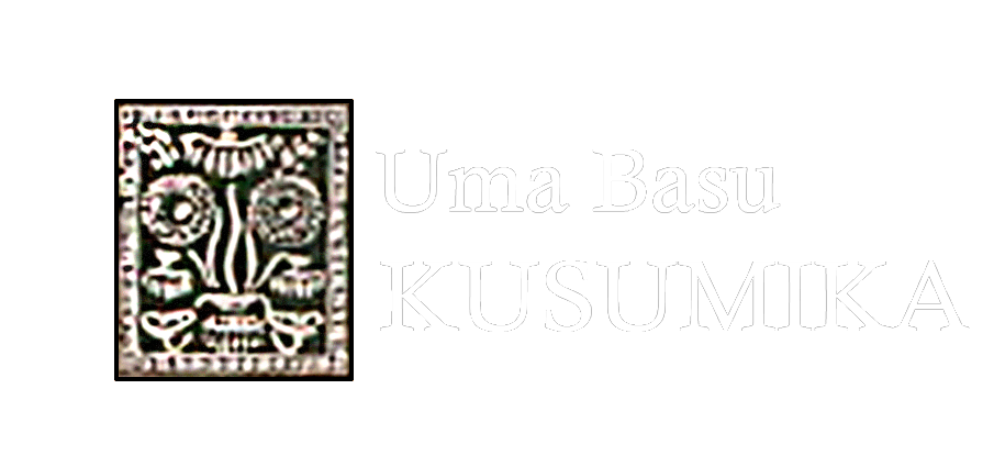
Uma Basu was a well-known floral artist for last four decades her effort to rejuvenal Indian floral art got recognition amongst flower arrangers of present days in India and abroad. Her keen interest in cultural heritage of India have launched her to revive many traditional and thorough exhibitions. In Kolkata, Delhi, Madras, and Uuk are for Japan. Now, she have taken a new venture(with a video disk) to emphasize creative and activities different section of artist high and low encircling famous Durga Puja festivals of Bengal. Mother Nature is a great mother in the form of Devi is providing her children food for their physical and emotional need year after year, decides after decades.
Uma Basu is a well-known name in floral art world in India and abroad. Her research and effort to rejuvenate Indian way of floral usage. Get recognition amongst flower lovers of present days.
Her keen interest in cultural heritage of India have been noticed in many of her exhibitions in Kolkata, Delhi, Madras, the United Kingdom, and Japan. An exhibition at the Asiatic society on “Evolution of Alfana” organized patterns of village women to decorate their home in turn of centuries developed into a cultivated art of present days and influenced other art forms. Equally laudable in her presentation of “Art in Bengali Wedding” at the Academy of Fine Art’s exhibition hall her efforts to survive many traditional arts in this field have given many ladies and small organizations a new opening to earn.
Her latest venture is with a videos dusk on art activities of different sections of artist- high and low ground Bengal’s famous “Durga Puja Festival.” Invoking of Mother Nature as Ma-Durga in Bengal is an elaborate social function and embracing all sections of people high and low. All pervading Ma Durga like human mother providing food for their physical and emotional need year after year, decades after decades.